Wild Hue Interiors
SERVICES
Brand Strategy
Naming
Brand Design
Web Design
Art Direction
Interior Styling
Wild Hue Interiors is the next chapter of Baltimore-based interior designer Emilie Schiller’s studio, formerly known as Home Methods. What began as a conversation about refreshing the existing brand and website quickly became an opportunity to think bigger. Together, we developed a new name, visual identity, website, and creative direction that better reflects the colorful, highly personal interiors Emilie is known for, while preserving the thoughtful process that has always been at the heart of her practice.
Color | Freedom of Expression | Joy
Naming
The original name, Home Methods, spoke to Emilie’s organized, process-driven approach, but no longer captured the personality or point of view her work had grown into. Through strategy and naming exploration, we landed on Wild Hue Interiors, a name that balances freedom and individuality with an unmistakable connection to color. “Wild” leaves room for the unexpected, while “Hue” speaks to the subjective and deeply personal nature of color. Together, they create a name broad enough to evolve with the studio while feeling distinctly at home in Emilie’s world.
Brand Design
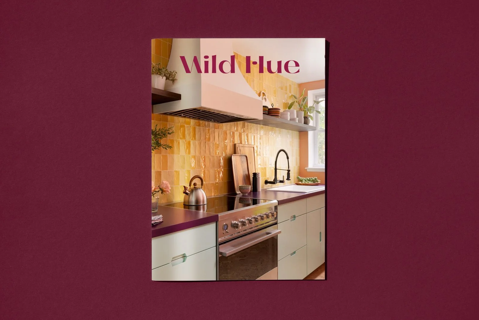
One of the central questions throughout the design process was: how wild is too wild? The name gave us permission to play, but the identity still needed to feel sophisticated enough to support Emilie’s work rather than compete with it. We explored expressive typography, bold color, and playful graphic elements, then intentionally dialed certain pieces back to create a system where personality and restraint could coexist.
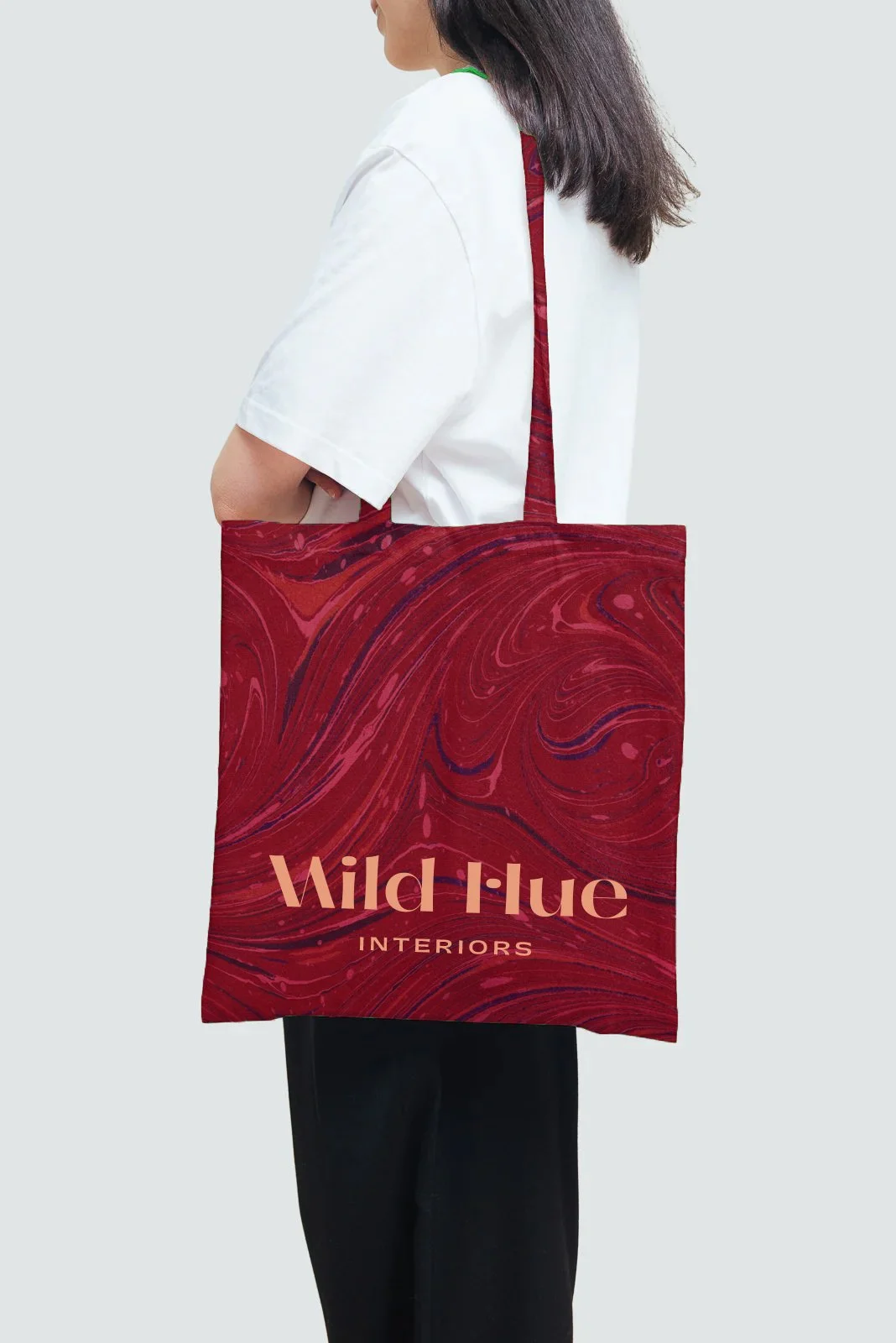
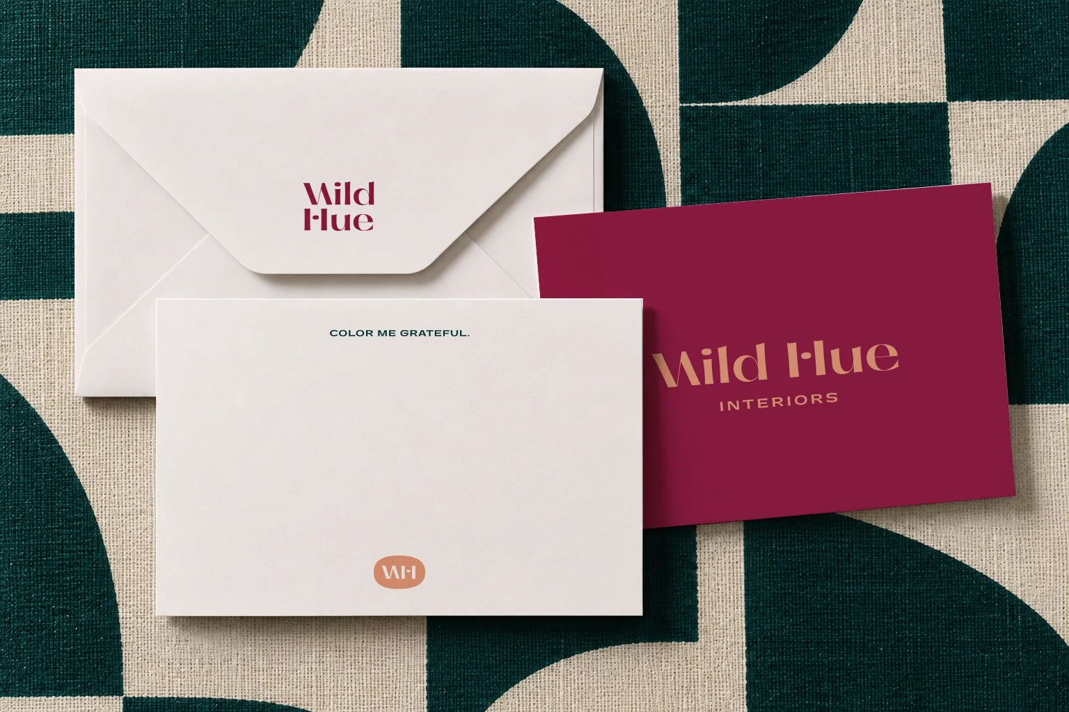
LOGO SUITE - The logo suite brings just enough visual interest to live up to the Wild Hue name without trying to be the loudest element in the room. Expressive typographic details give the identity a distinct personality, while the overall treatment remains relatively restrained, creating space for the color palette, photography, and Emilie’s interiors to take center stage.
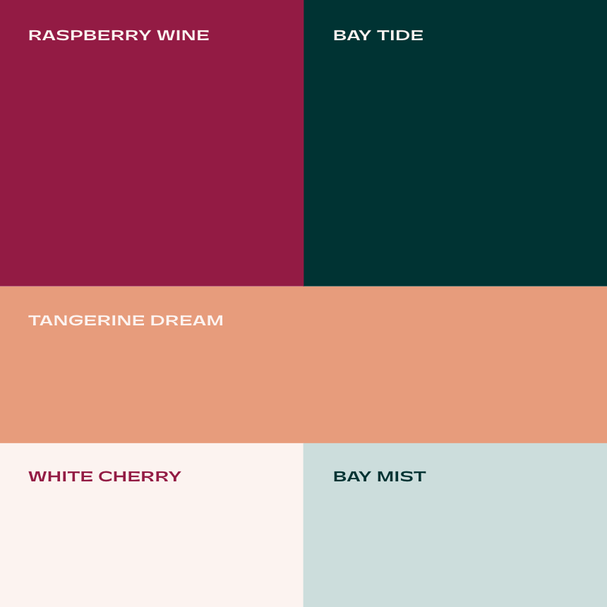
COLOR PALETTE - Color is where we gave ourselves permission to turn things up. The primary palette combines five colors across warm and cool, dark and light, forming the foundation of a truly bold and dynamic color system. Rather than relying on one signature brand color, the palette is designed to shift and recombine across applications, giving Wild Hue a visual identity that can feel different from one moment to the next while remaining recognizably its own.
CLIENT RESPONSE
"Limonata helped crystallize what is most important to me about my work and brought Wild Hue to life in a way that feels authentic to who we are and where we're headed.”
“I previously worked with Giulietta on art direction and styling for a shoot, and I've always admired her work, so when I learned that Limonata Creative was expanding to include branding and website design, it felt like exactly the type of team I wanted to work with. They were people I already knew and trusted, who also took the time to really get to know me and understand what I was trying to convey through my business
Nate asked thoughtful questions and helped distill how I think about design into ideas and language that truly felt like me. There were more than a few moments where I thought, ‘Yes, that, I've been trying to say THAT!’ From the naming process through the new identity and website,
Limonata helped crystallize what is most important to me about my work and brought Wild Hue to life in a way that feels authentic to who we are and where we're headed.”
– EMILIE SCHILLER | Principal Designer & Owner
Web Design
For the website, we translated that same balance of personality and structure into a digital experience designed to make Emilie’s work the hero. Playful project names, shifting color palettes, expressive details, and subtle interactions bring the Wild Hue personality into the experience, while a clear information hierarchy makes it easy to explore the studio’s approach, services, portfolio, and process.
The site also introduces Color Story, an editorial space for project stories, inspiration, process insights, and the occasional design rabbit hole, giving the brand room to continue evolving beyond the portfolio itself.
Art Direction & Interior Styling
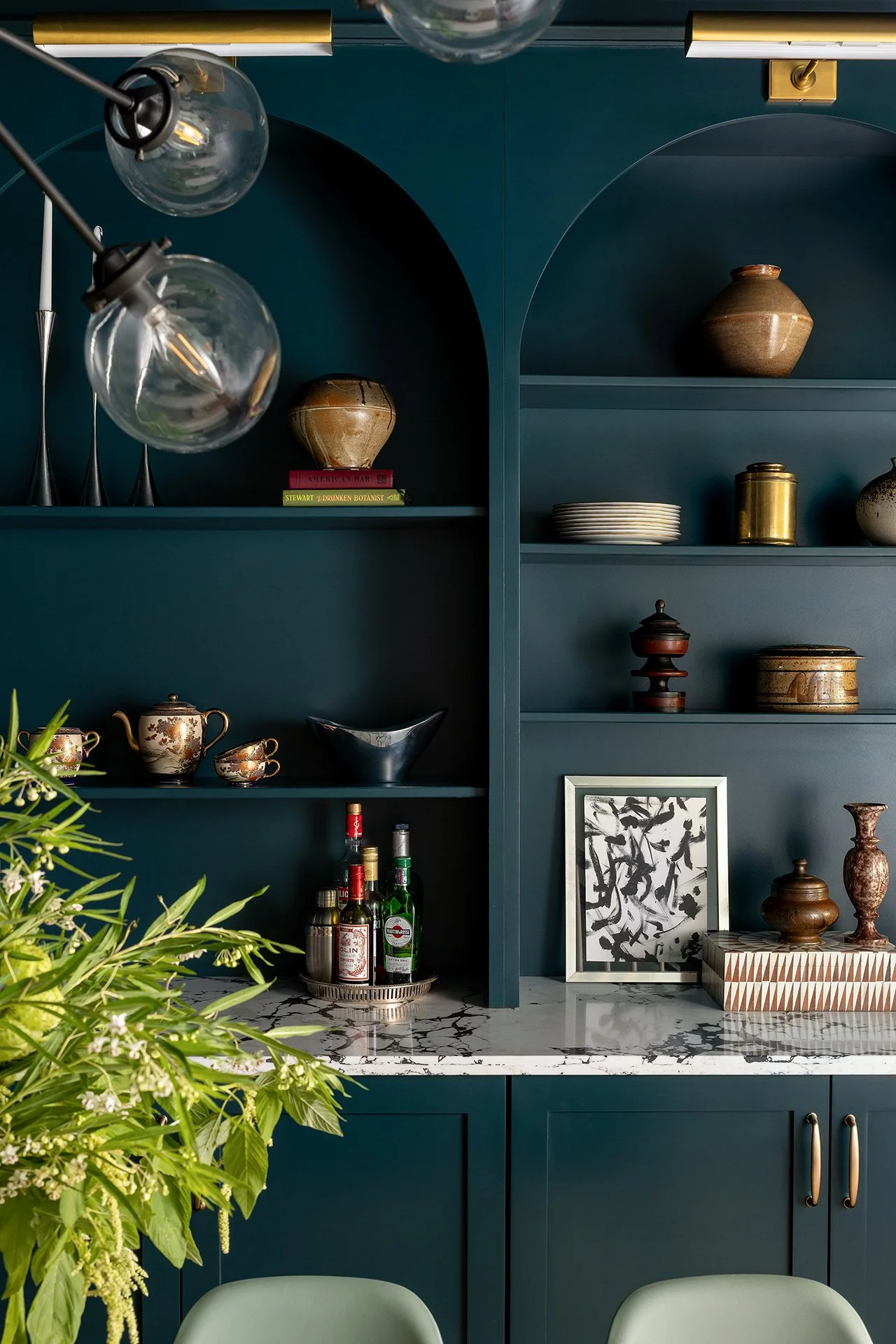
GREAT ARCH SUPPORT
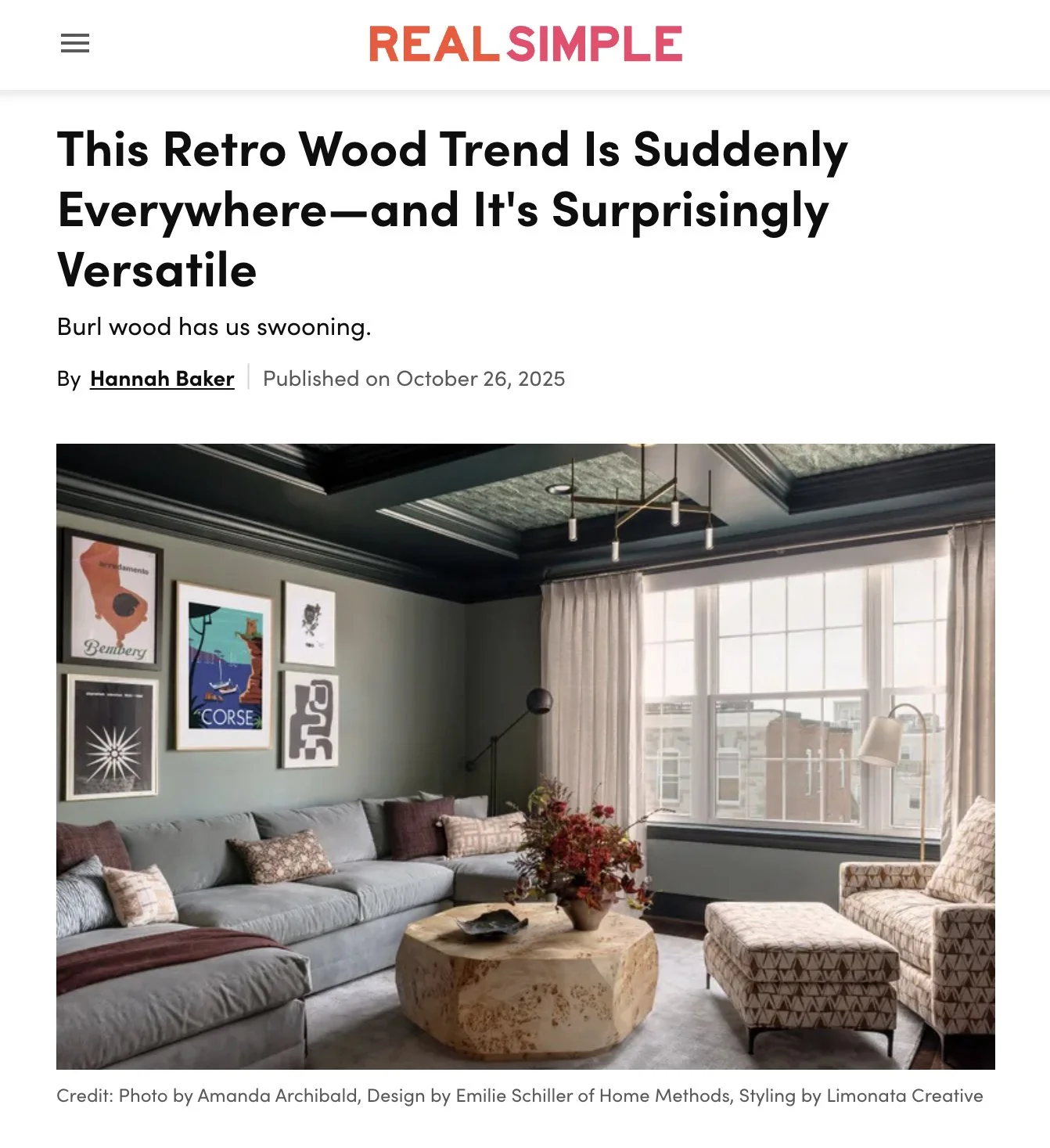
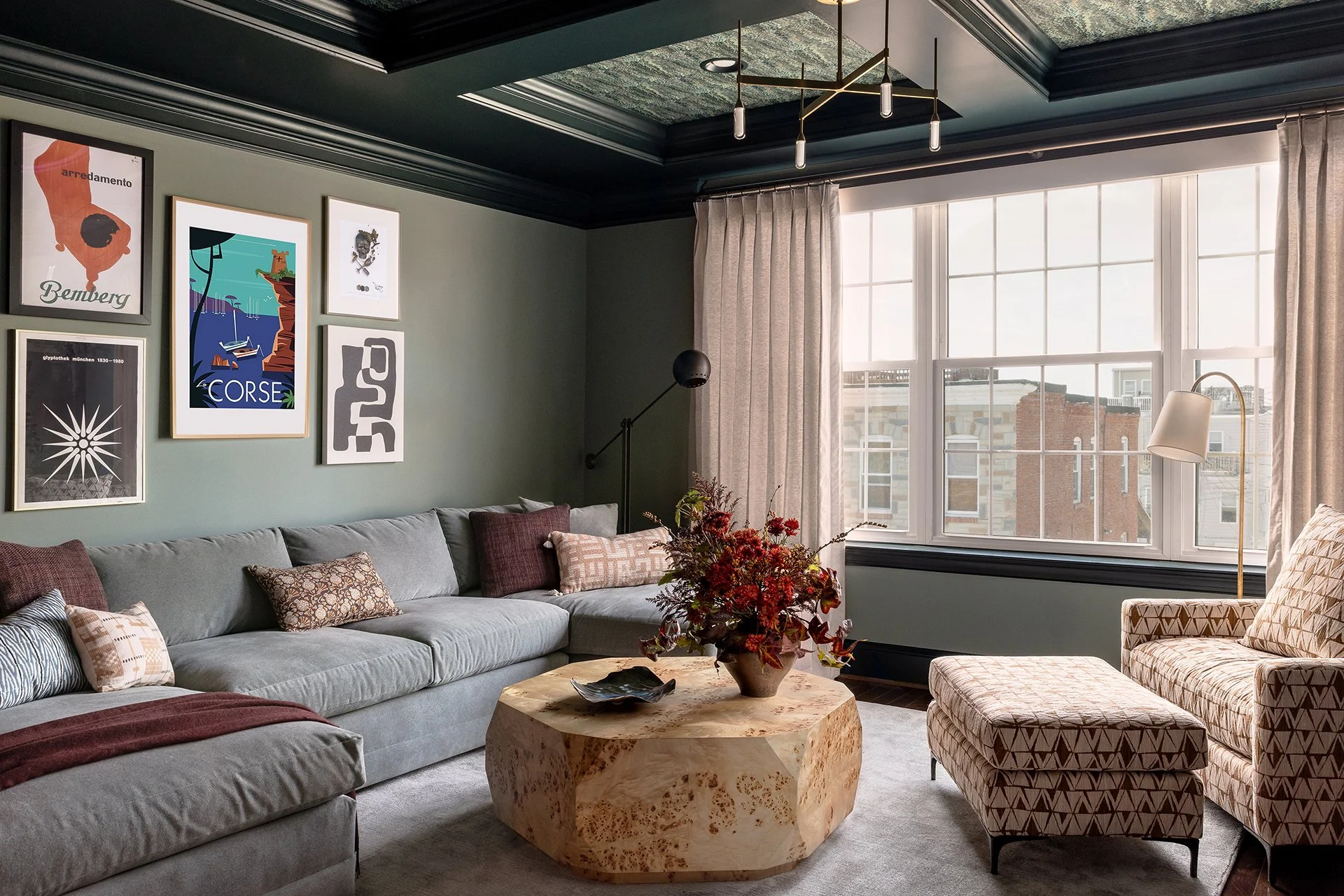
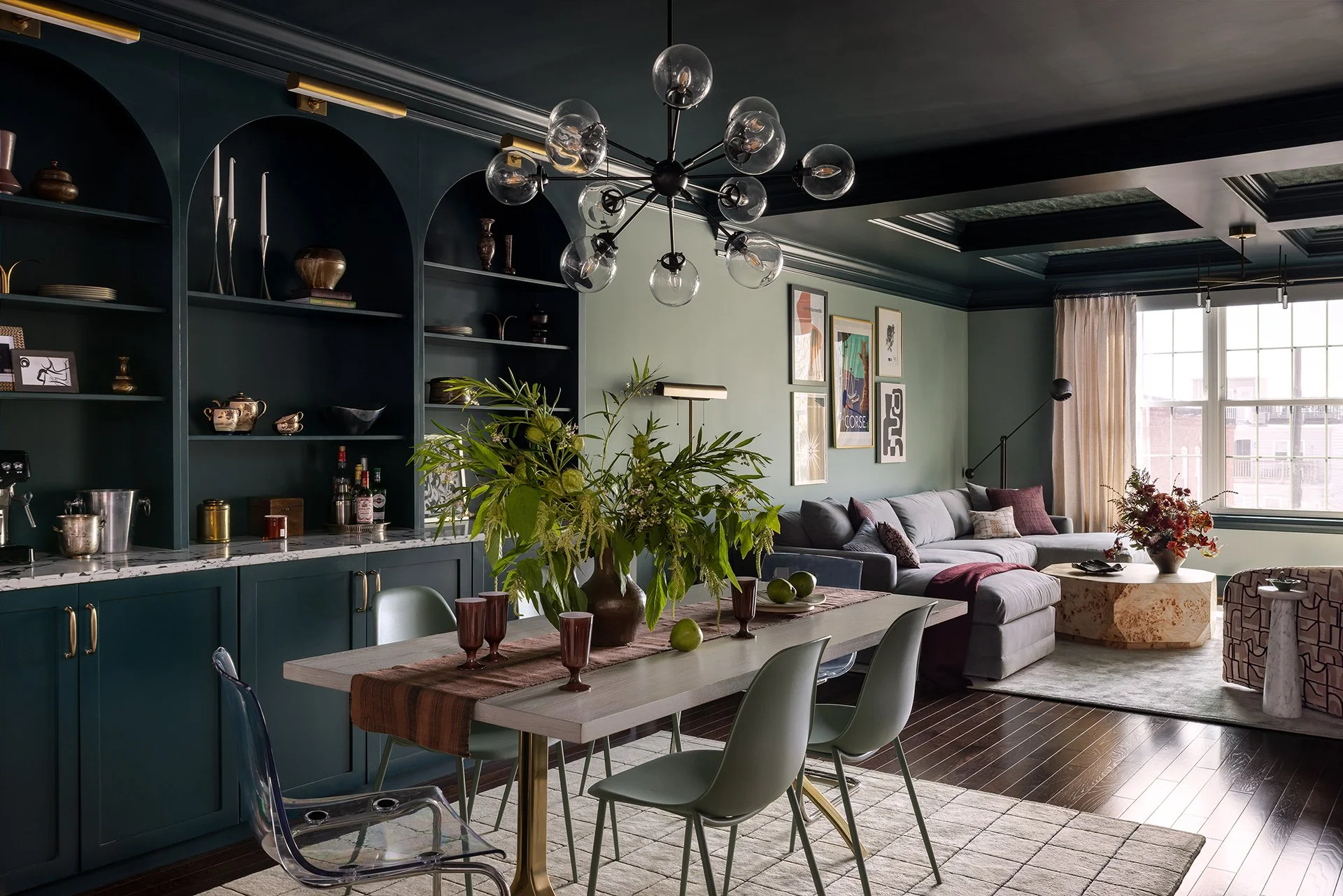
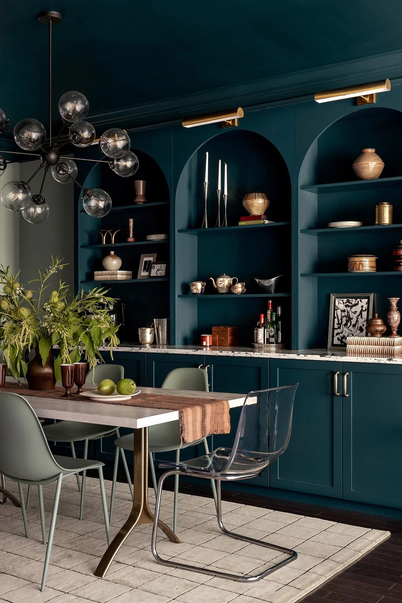
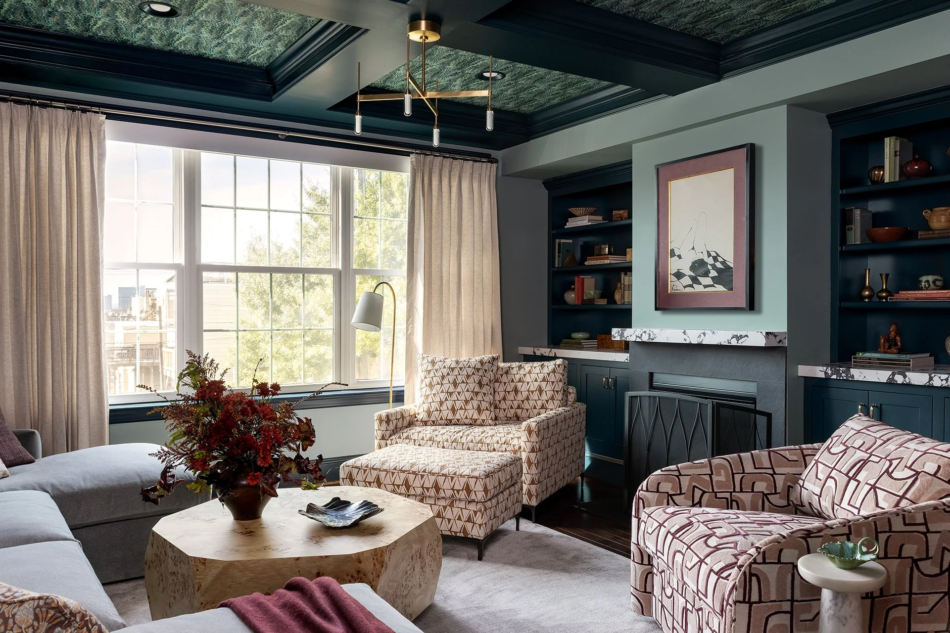
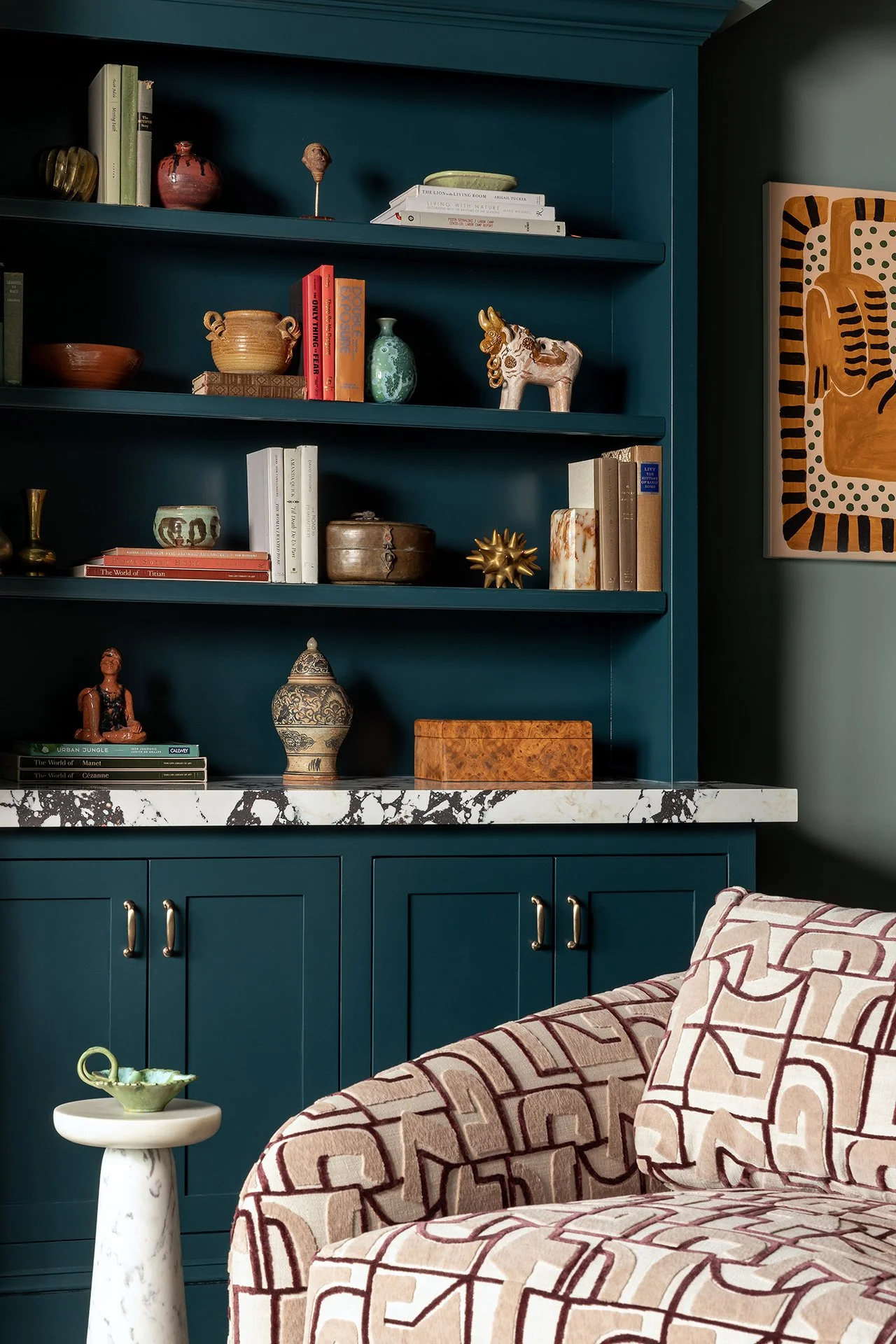
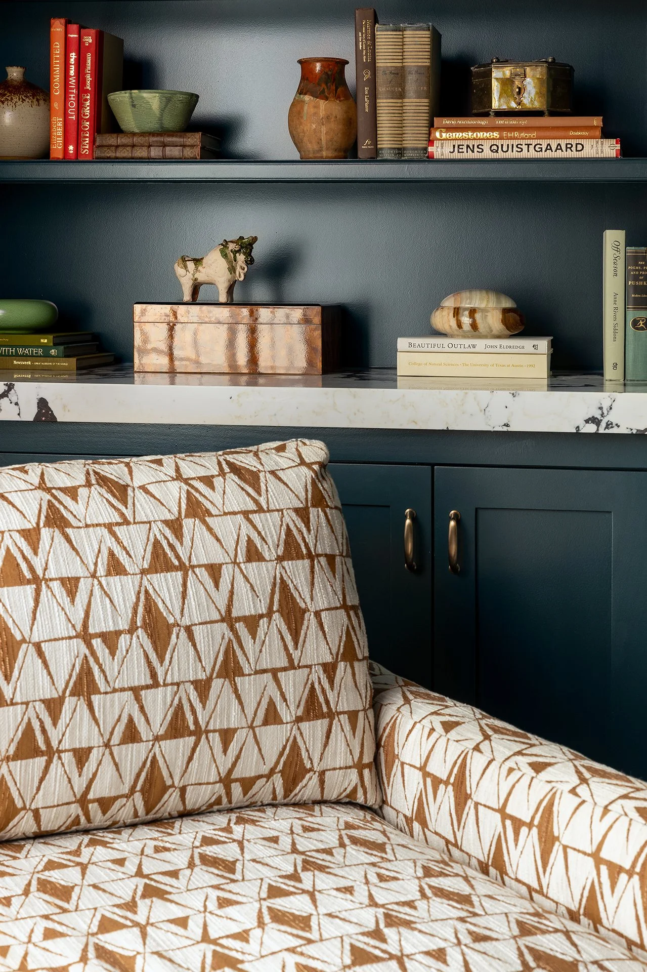
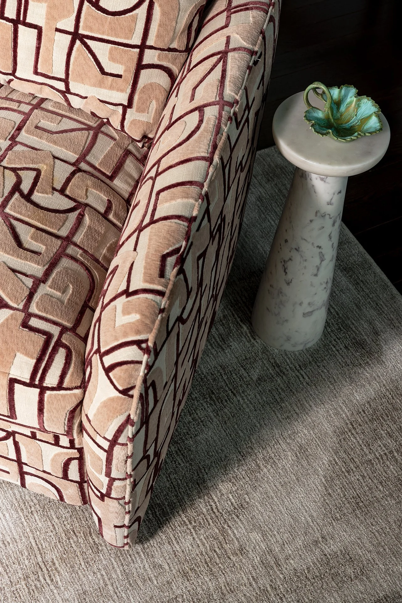
Our collaboration with Emilie began before Wild Hue was Wild Hue. For this color drenched Canton rowhouse, Limonata provided interior styling and art direction to help prepare the project for photography and shape how the finished spaces would be seen. Working with Emilie’s layered mix of pattern, deep teal, graphic accents, and custom details, we focused on the final composition of each room, refining objects, artwork, textiles, and styling moments to create images that felt lived-in, expressive, and editorial. The project became an early example of what our broader collaboration could look like: brand, interiors, styling, and imagery all working together to tell a more cohesive story.
Credits
Interior Design: Wild Hue Interiors
Art Direction & Interior Styling: Limonata Creative
Northern Virginia Shoot: Amanda Archibald
Interior Decor: Prop Up Shop