
Hotel Xacuan
CREATIVE PRODUCTION / ART DIRECTION / PROP STYLING / SET DESIGN / NAMING / BRANDING / FONT DESIGN / PRINT DESIGN
ADDITIONAL CREDITS:
Photography: Kyle Dorosz
Wardrobe Styling: Danielle Wood
Food & Drink Styling: Emilie Fosnocht
Talent Agent: Misty James
Models: Nick, Lily, Maddy
Select Furniture: Good Neighbor
Studio, Props & Surfaces: Prop Up Shop
PROJECT DESCRIPTION:
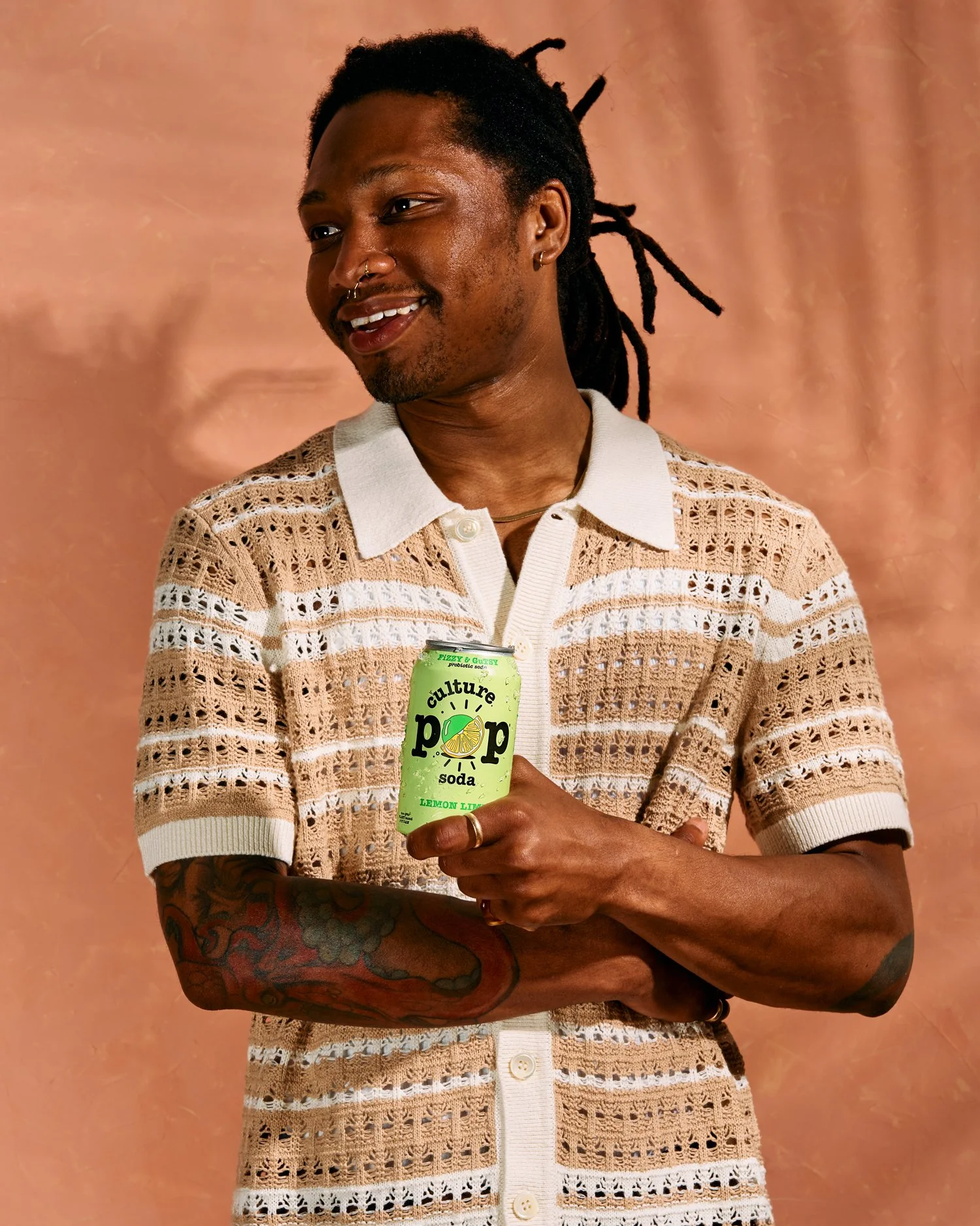
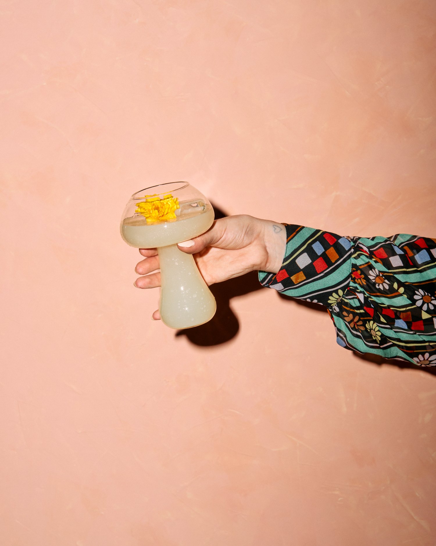
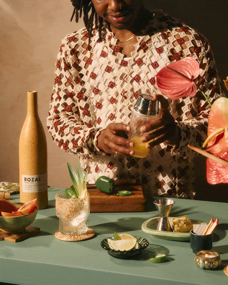
An all encompassing creative passion project inspired by travel to highlight Limonata’s full set of skills. Giulietta and Nate teamed up with NY based photographer Kyle Dorosz, recruited regional stylists & talent while sourcing set materials from Baltimore based shops while pulling from Prop Up Shops own collection to form a powerhouse collaborative with a curated selection of beverages as the product focus. The creative direction is centered around a fictitious boutique hospitality experience steeped in tropical 70’s vibes.


“As the creative & art director of the shoot, I wanted to weave a story that resonated with a spirit of wanderlust & living in a state of perpetual summer. My husband, Nate, and I had recently taken a 6 month travel sabbatical around the world - mainly countries in South America and Asia; so I wanted to try and translate that experience into visuals. In brainstorming how I could fulfill this ambition, I closed my eyes, almost meditating, and searched for cues. After a bit, I realized that beats - words - were emerging in my mind; and that the words were rhyming.... that I was composing a poem. So, I wrote the poem down and in turn, this fluid process helped me understand the location, mood & aesthetic for the scene”. - Giulietta
The poem read as follows:


“ Following Giulietta’s lead I looked back to our travels through through Central & South America for inspiration. I loved learning about the history of the native civilizations and appreciating the rich indigenous cultures. I decided to call our imaginary place "Hotel Xacuan" and that it had a petite tiki bar, named "Coltia". In the Náhuatl language: “Xacuan” means ‘beautiful yellow petals’; “Coltia” means ‘twisted, or bent’… something that comes naturally when you have a good cocktail.
The graphics and specifically the primary font we used was a custom creation inspired by building signage on the ‘mercado’ across from our bnb in Oaxaca, MX. We’ve made this font (aptly named Mercado) available for purchase in our shop.
So what started as a poem, eventually turned into custom branding for our imaginary hotel, bar, menus, various tile treatments, and finally, a food/beverage photoshoot that brought it all to life. Some people might say we got carried away, but it never felt like it to us... it just felt right”!
- Nate


GALLERIES: