Angeline & Co.
SERVICES
Brand Strategy
Naming
Brand Design
Web Design
Art Direction
Interior Styling
On our first call with the then ‘AGD’ crew, it was clear: this wasn’t just a logo refresh. Owner, Angeline Guido Hall had just crossed the 10-year milestone, and with it came a big realization that her interior design studio had grown beyond a single designer. What started as ‘Angeline Guido Design’ - a small but mighty 2-person firm in Dallas, Texas had evolved into something bigger, a true collaborative team effort with projects located nationally. The new brand needed a new name to celebrate the collective, not just the founder. Along with the new name came a bold brand identity and a site that not only showcases their work but provides a window into their design team and what drives them creatively. We also collaborated with Angeline & Co by providing art direction for two luxury and distinctly unique projects: One in northern Virginia (pictured below) and another in northern Maryland (coming soon!).
Traditional + Minimal = Modern
Naming
We brought a series of names to the table—some wildly new, some that stuck close to their roots. After weighing all the pros & cons, the team kept circling back to Angeline. It’s distinct, it’s elegant, and it already carried a decade of brand equity. Adding “& Co.” was the simplest, smartest move—instantly honoring the collective team while providing flexibility for future growth outside of their current design services. Proof that sometimes less really is more.
Brand Design
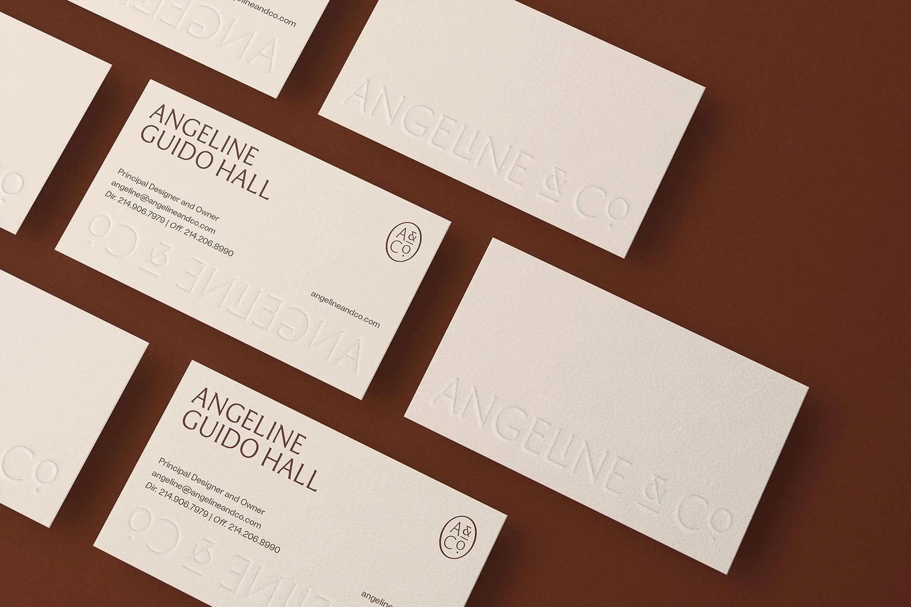
LOGO SUITE - For the logo, we went custom. A typography-driven suite that flexes as effortlessly as A&CO’s interiors—timeless with a twist. Think of it as “transitional” in design terms: a traditional foundation, modernized with flared serifs and slimmer proportions, plus a few unexpected old-style quirks in the I, &, and O. From the primary logotype, we built out a full system—monogram, seal, and variations along with a playful tiled font treatment for their accompanying blog—giving the brand tools that feel as refined and versatile as the spaces they design.
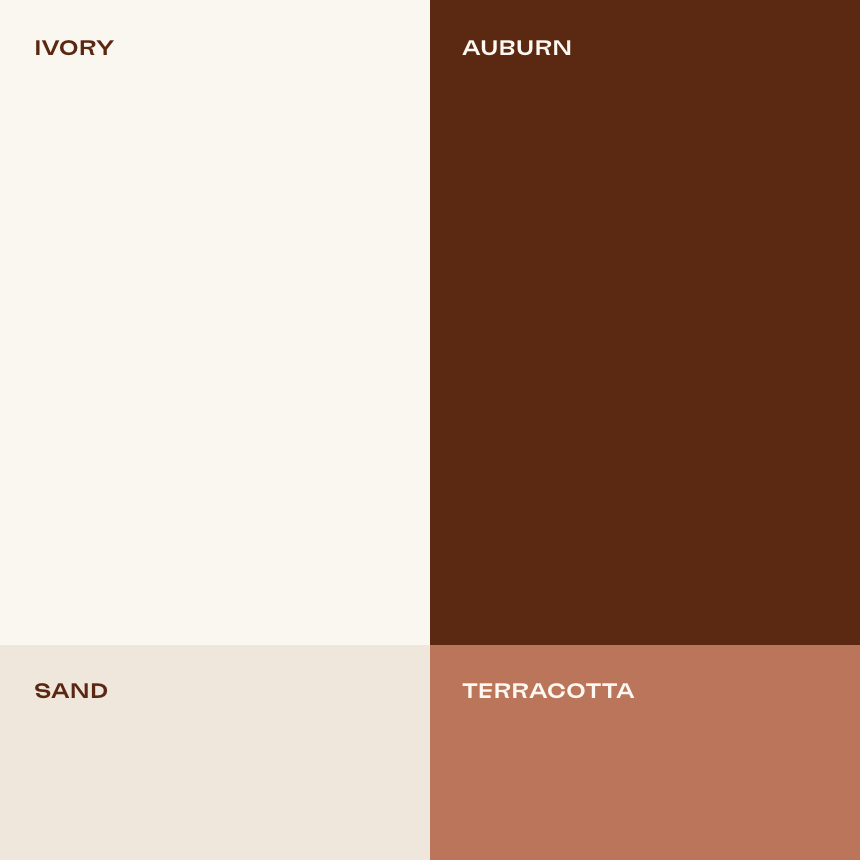
COLOR PALETTE - Warmth comes through in every shade—ivory, sand, terracotta, deep auburn. The mix is minimal but grounded, earthy yet bold. It’s a palette that doesn’t play it safe; it amplifies A&CO’s designs with quiet confidence.


CLIENT RESPONSE
"When I started, it was just me. Over the years, we’ve built an incredible team who share so much of the creative load. I wanted our name and brand to reflect not just me, but all of us collectively.
To help us with this transformation, we partnered with the incredibly talented team at Limonata Creative. From the very first conversation, they just got it. They understood our story, our sensibility, and the values that drive us. Together, we created a brand identity that feels timeless, elevated, and most importantly—true to who we are.
The process was energizing and inspiring, and I’m so proud of what we’ve created together. This new chapter isn’t just about a logo or a website—it’s about capturing the spirit of collaboration, creativity, and connection that’s at the heart of everything we do.
I see us expanding into new markets and maybe even product design, but always in a curated way. This rebrand gives us the foundation to grow while staying true to who we are”.
– Angeline Guido Hall | Principal Designer & Owner
Web Design
We brought a series of names to the table—some wildly new, some that stuck close to their roots. After weighing all the pros & cons, the team kept circling back to Angeline. It’s distinct, it’s elegant, and it already carried a decade of brand equity. Adding “& Co.” was the simplest, smartest move—instantly honoring the collective team while providing flexibility for future growth outside of their current design services. Proof that sometimes less really is more.
Art Direction & Interior Styling
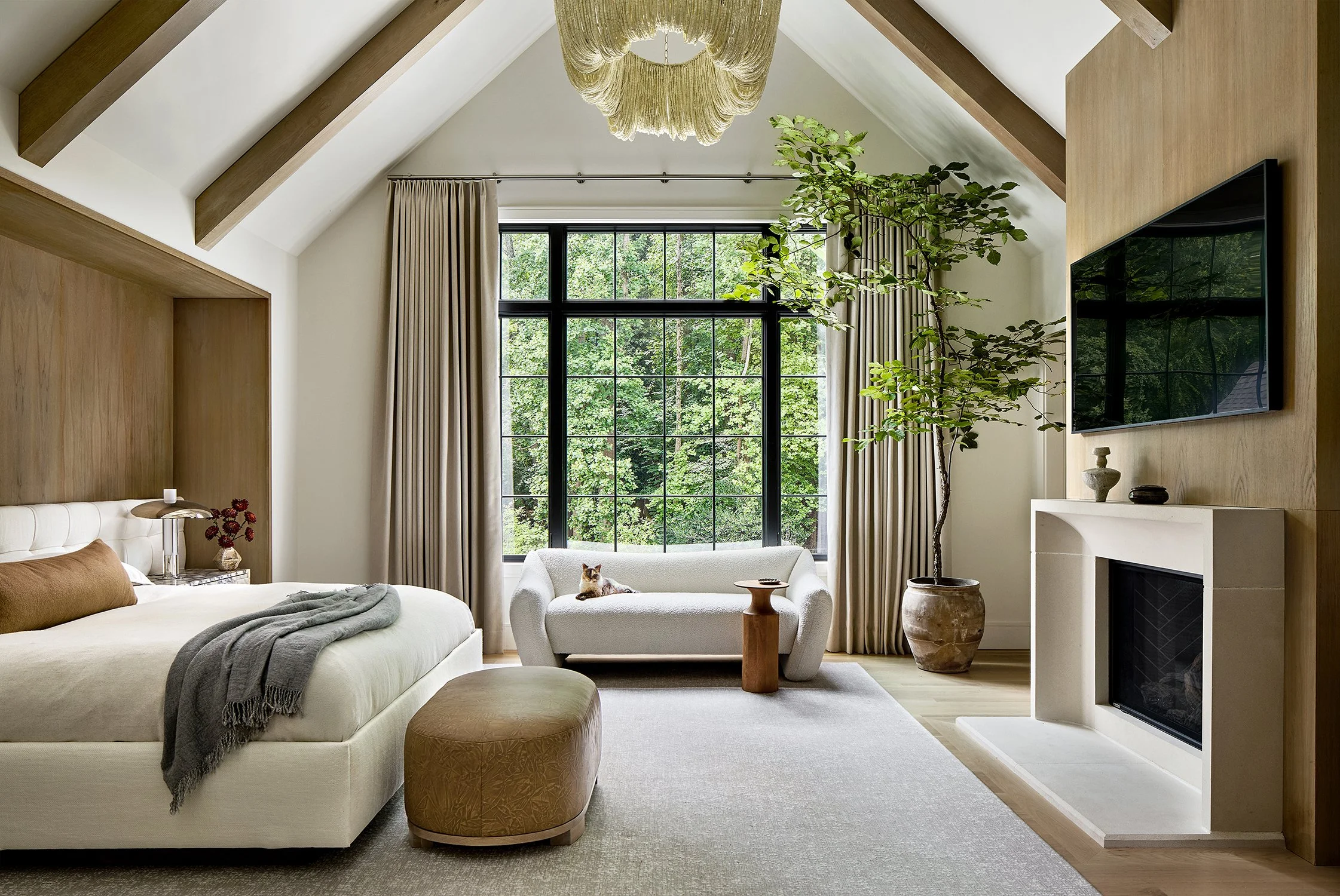
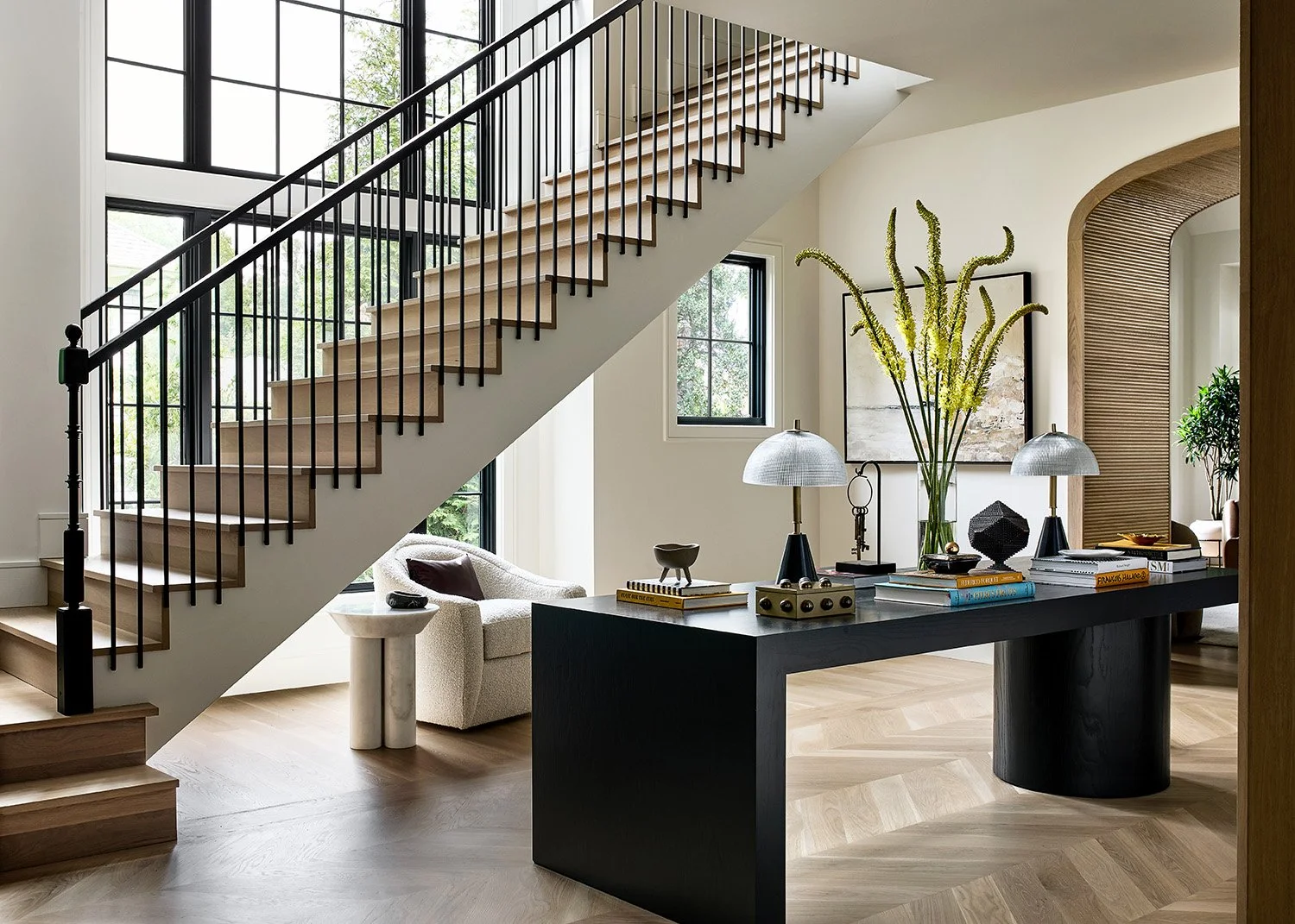
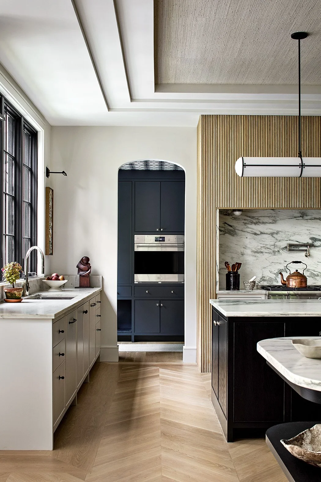
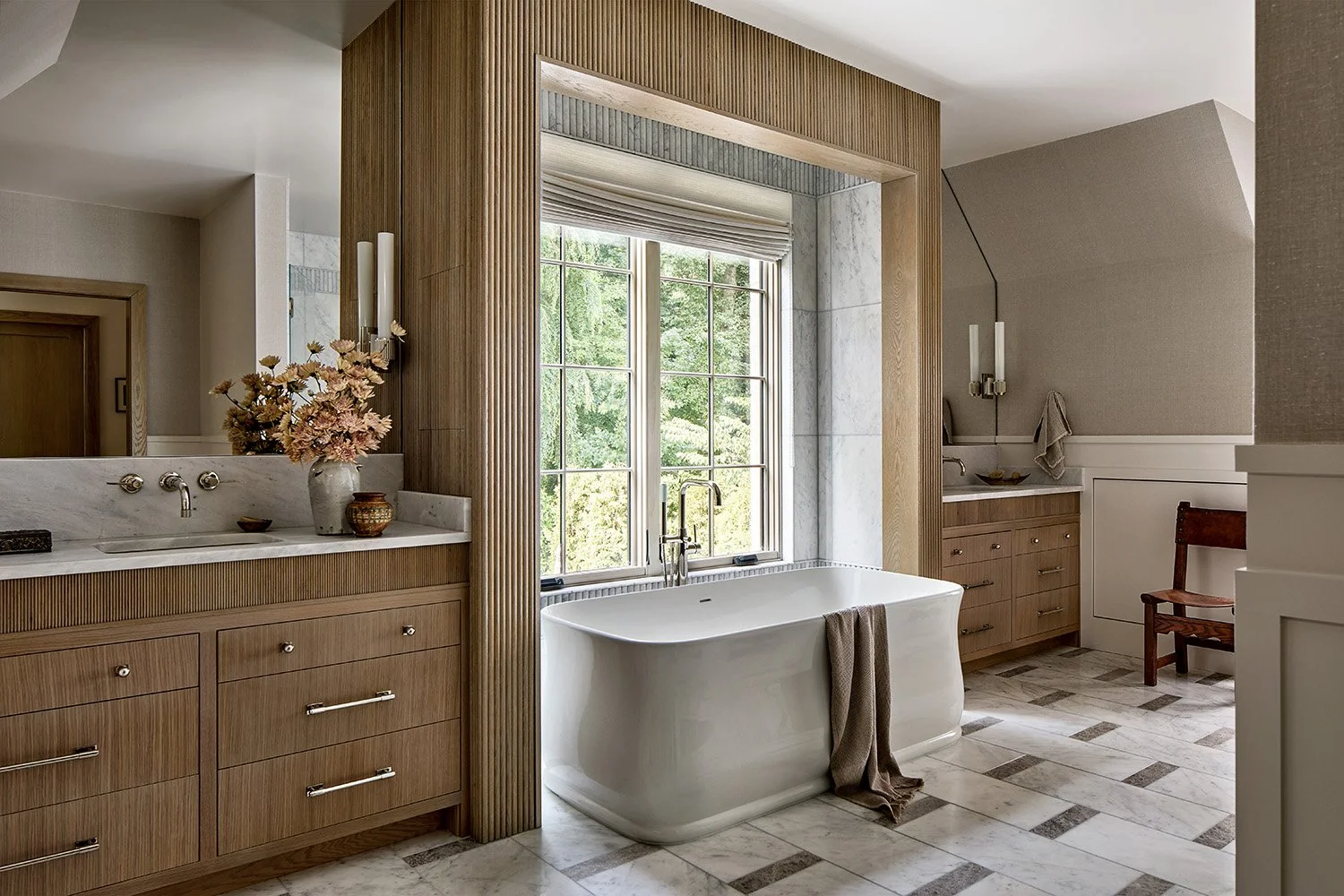
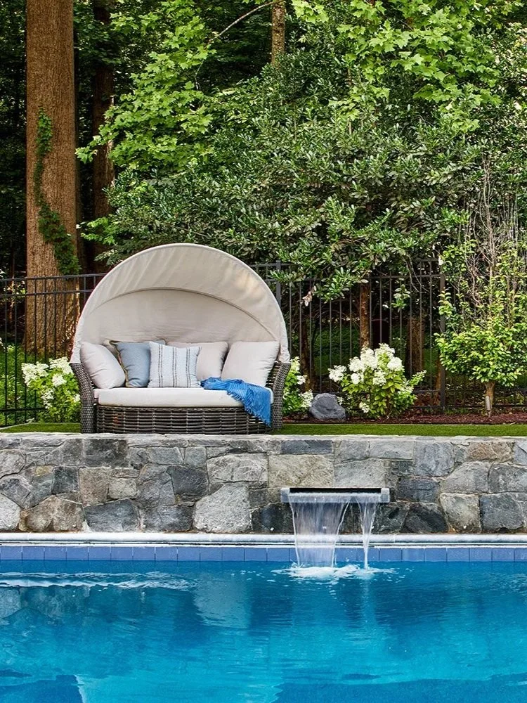
NORTHERN VIRGINIA
Modern, curated, approachable, luxury. Working closely with Angeline & Co, we developed a styling plan that honed in on those four crucial elements to nail down the desired aesthetic, styling and storytelling for this gorgeous, custom home in Northern Virginia. Every decor item, floral and branch was custom sourced and styled with intention.


Credits
Interior Design: Angeline & Co.
Art Direction & Interior Styling: Limonata Creative
Northern Virginia Shoot: Stacy Zarin Goldberg
Maryland Shoot (Coming Soon!): David Mitchell
Interior Decor: Prop Up Shop